2 Centuries, 2 Peoples, 2 Rivers
Remembering How It Began
Kamloops is a historic city that is centrally located in the Interior of BC. Its exact location can be found at the point where the North and South Thompson Rivers intersect. Its municipality has significantly developed within recent years and historically speaking, Kamloops began only as a Fort. It was however, the involvement of the Canadian Pacific Railway during the 1860 's, and the Gold Rush of the 1880 's that both inspired a population growth into an established value of 500 peoples.
The ethnicity of the people in Kamloops were originally diverse in culture but in majority consisted of Aboriginal, British, and French. The name ''Kamloops,'' was given by the Secwepemc —or Shuswap Indigenous— peoples and its original Salish form of Tk'emlups translates into an understanding of 'confluence'.
It is a reference to the Earth's Geology that describes two bodies of water meeting at an intersection.
A French significance may also be interpreted in the annunciation of the City’s name as 'Camp de loups' which translates to: ''Camp of Wolves.'' The Thompson River University of Kamloops is a historic University (TRU) and it endorses this French connotation through an incorporation of the Wolf as their mascot.
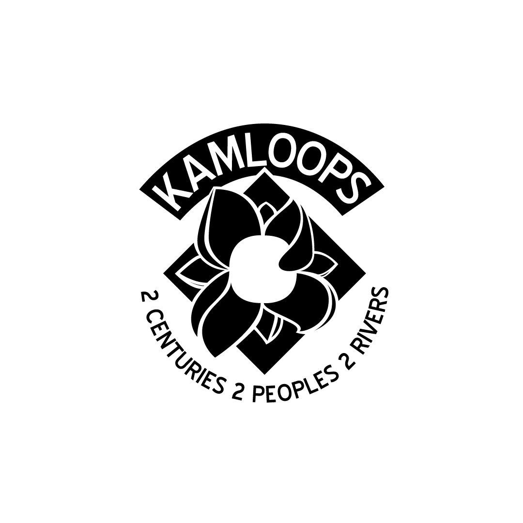

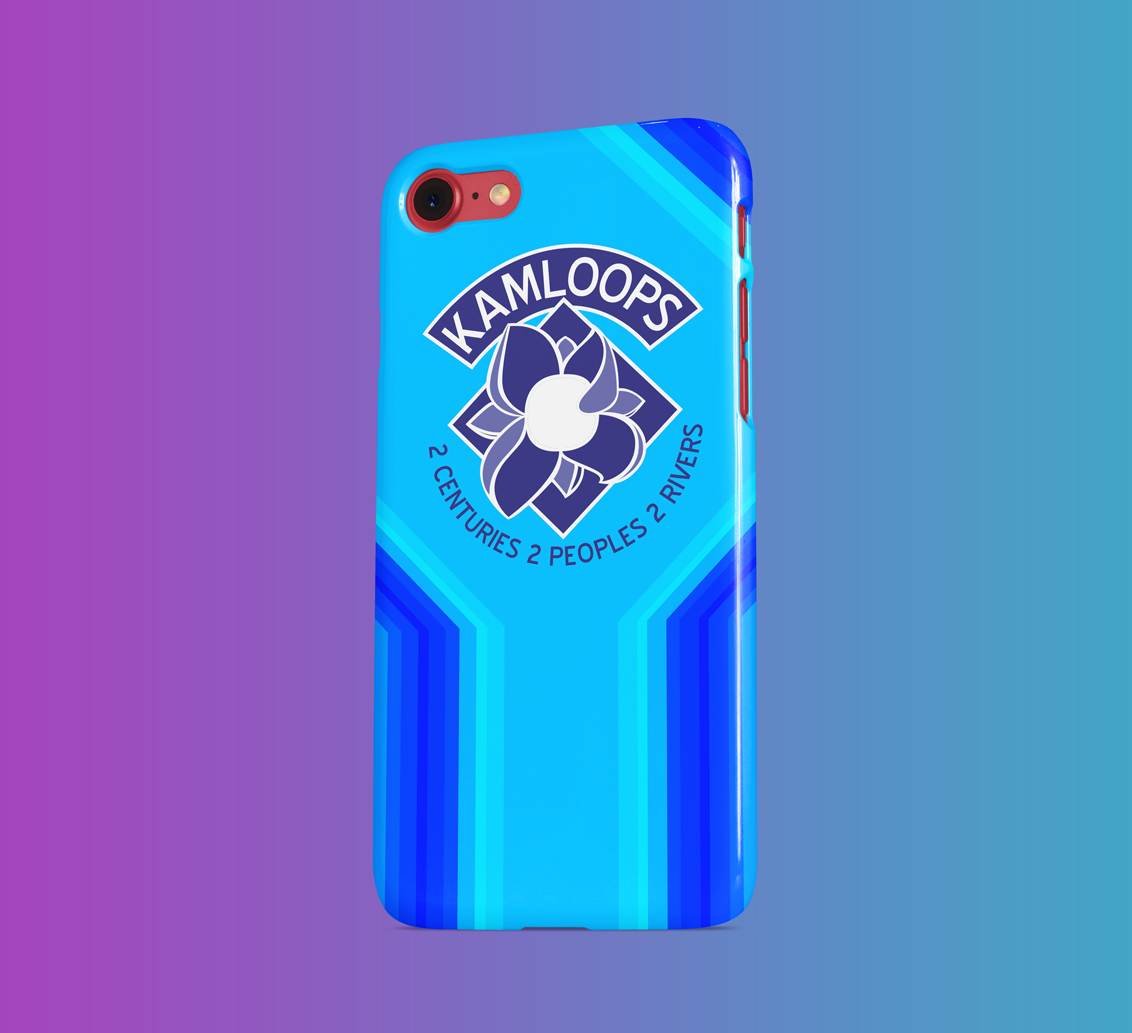
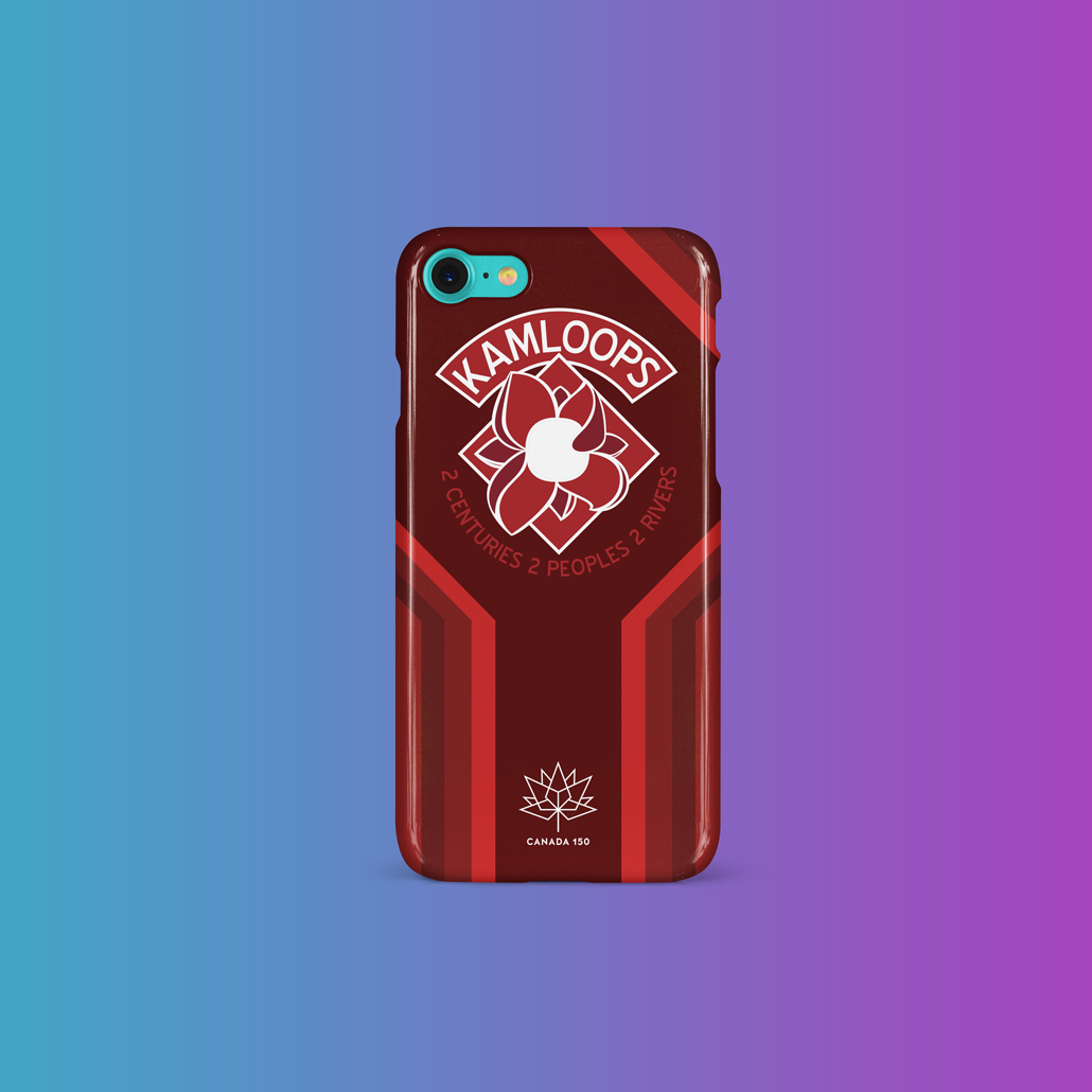
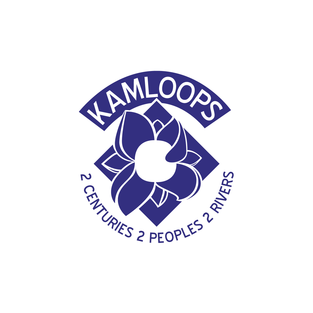
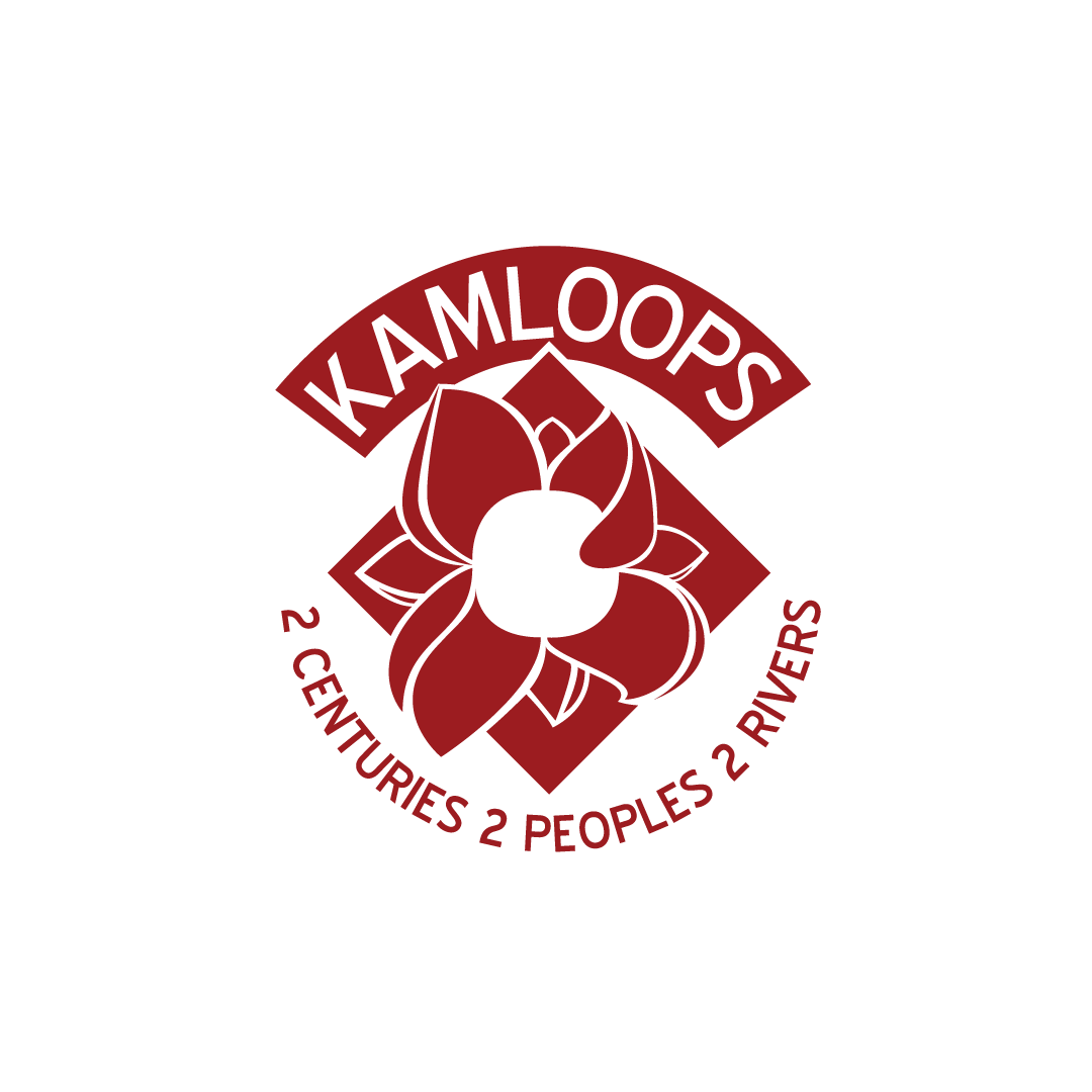
This identity project holds structure to the embodiment of a flower that can be perceived by the motion of its leaves and petals. This attribute in specific makes significant reference to the letter K for Kamloops as well as a communal value for social sustainability. Each petal having its own distinction was initially rendered as a diversity of peoples coming together to the core center of the white bloom.
The white center and the top right pedal, we seen as a person playing the drum for the Kamloops people as a sign or atonement for people to collect among each other.


Besides the diamond in the back of the flower itself, all of the lines of this design are completely organic. This was done for the connotation of unique value and humane relativity that the logo was intended to convey.
A clean use of formal colour, and high contrast value between the black/white and reds or blues evoked a contemporary feel that was sharp and precise, but also soft, welcoming and heartfelt.
A clean use of formal colour, and high contrast value between the black/white and reds or blues evoked a contemporary feel that was sharp and precise, but also soft, welcoming and heartfelt.
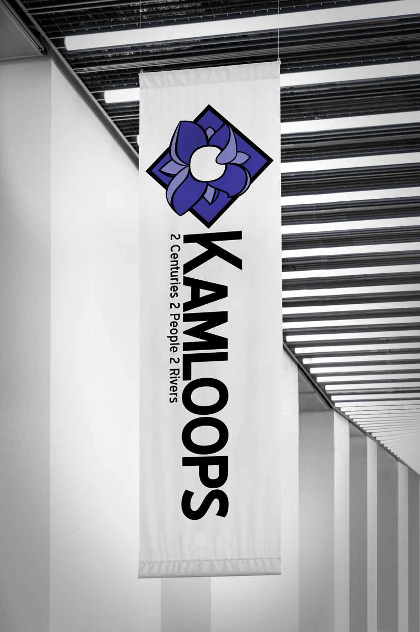
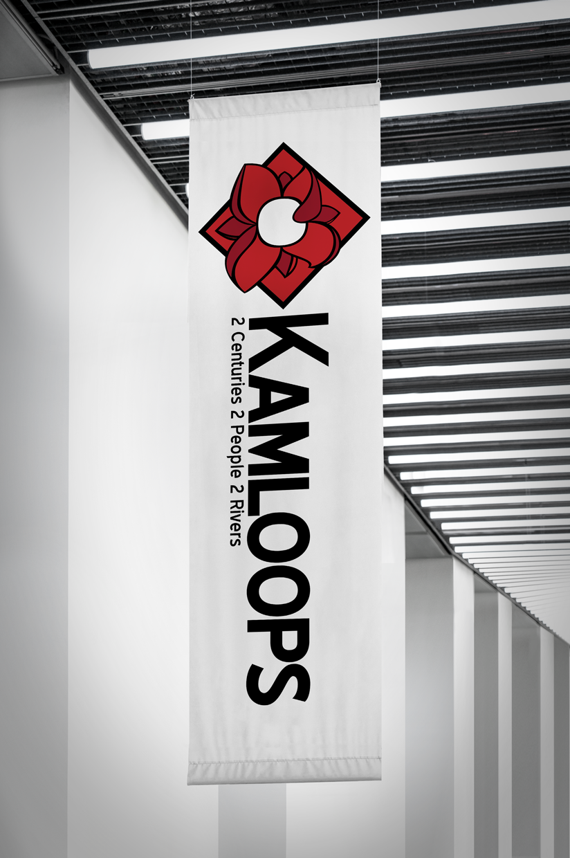
These gorgeous vertical canvas based banners were included as a means to begin the social campaign for the publics' acknowledgement within the municipality. Changing a logo/pictograph of a city, town, province or heritage based environment is a huge undertaking. This is because people all have to meet on a basis of agreement for the future recognition of how their group or population are going to be recognized as.
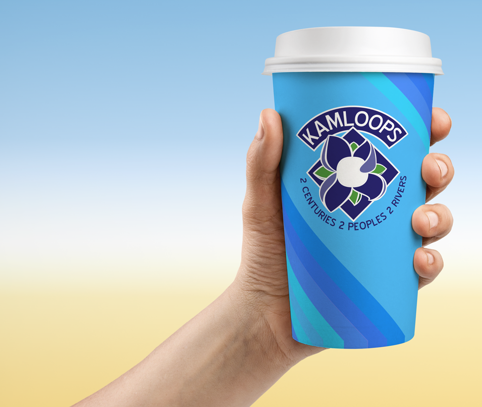
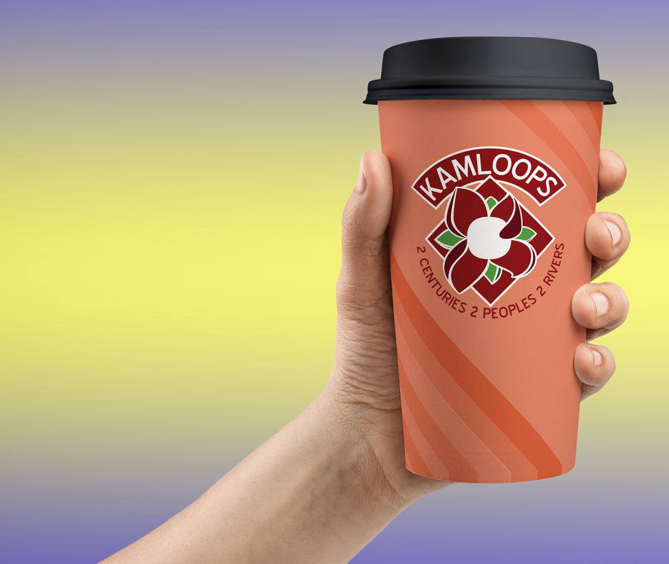
Take for example these cups, each with colour tones analogous to themselves, but most likely only ideally opportune during different seasons. Light blue in the summer, spring and winter seasons or the rustic red during the fall. To be considerate of the pedestal this type of project is sitting on, imagine everyone in your city for a week to a quarter showcasing the design at public events, and a photo or caption where a multitude of people are the subject of a photo, but the focus is the multiple amount of cups in their hands.