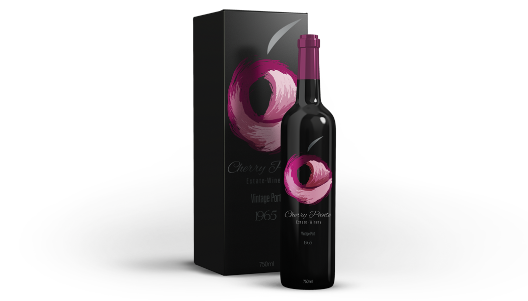
1965 Vintage Port
A New Era For a Longtime Winery
This illustrious project was intended as a re-brand for an already established winery. The all black matte finish box and it's gloss overlay are intended for the limited edition Vintage Port flavours, and the others were for single bottle sales, in which an all black/dark glass bottle would be accompanied by a foil reflective cherry logo. The flavours outside the Vintage Port Include: Blanco, Pinot Noir, and Rosé.
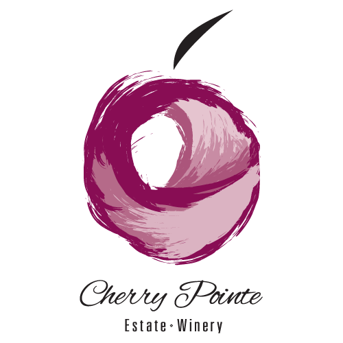
The painted cherry emblem within the logo is meant to represent the pouring of wine into a glass. The colours and depth of the wine are refracted with light during this act as a substantiated approach to the opportunity of its market line. Additionally an eagle with a rounded wing can be seen surfacing into the air of a summit peak.
Amalgamation is a constant inclination in the field of graphic design and this project really takes the abstract, concrete & the level of quality that a higher end product/brand can have, and blends them into several very keen and developed ideas.
Amalgamation is a constant inclination in the field of graphic design and this project really takes the abstract, concrete & the level of quality that a higher end product/brand can have, and blends them into several very keen and developed ideas.
The typography of the brand is concise and clairvoyant to the aesthetic of having the company name painted in cursive with a very light brush that carries the weight of each letter to the next.
The 'Estate-Winery' section is a minimal representation of an immense and inclusive value that also contains a diamond shaped glyph between each word as a notion to fortune/fortunate works.
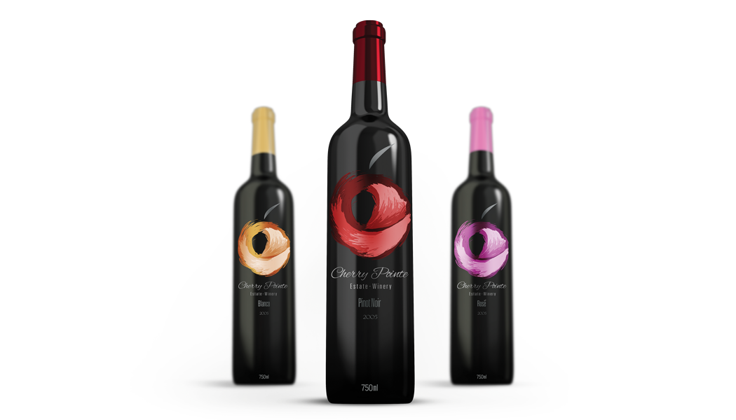
Blanco; Pinot Noir; Rosé
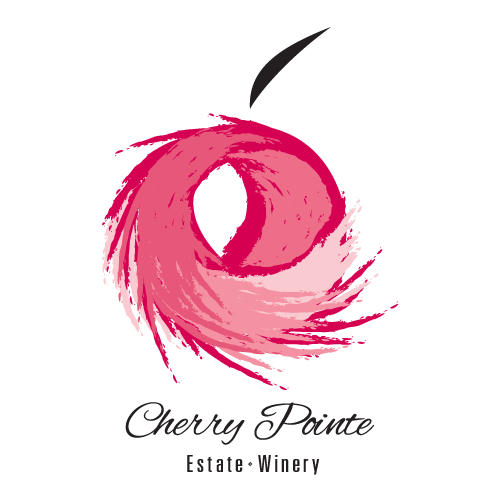
Alternative Approach