
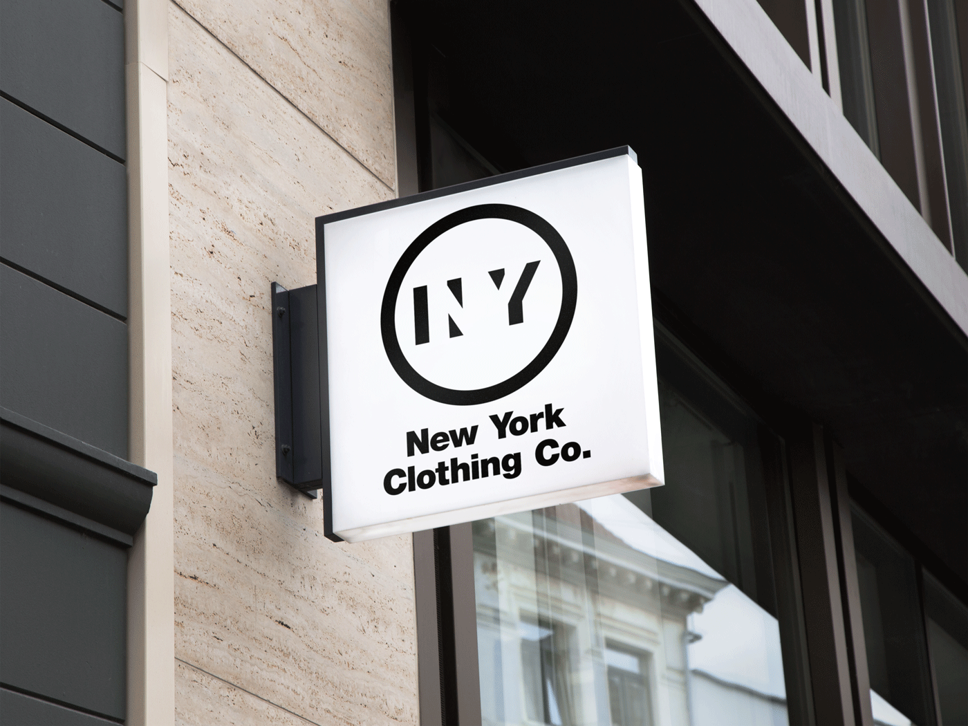
Keeping it Clean & Conceptual
Inspired by Mossimo Vignelli
This Neo-sans application showcases an ode to Mr Mossimo Vignelli, the creative type designer behind the mass appealed type setting: "Helvetica" that is used within the New York City Subway. The dynamic placement within the emblem showcases a dissipating shadow of both the 'N' and the 'Y' as a contemporary conception that stands out as unique in comparison to many other usages of the Helvetica type face.
As seen below, additional expansions were added to the design proclamation as a means to imply an international appeal.


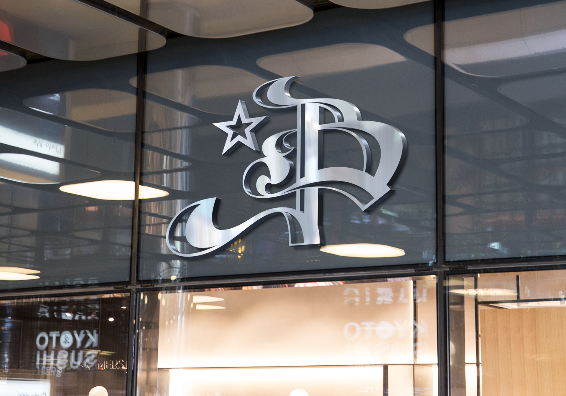
IMMERSIVE IN STORE APPEAL
Both Sky & Street.
This 'B' for Brooklyn is an in-store backdrop letter-form that would be showcased within the store and behind the cash desk where customers would pay for their merchandise. The implication with its aesthetic is to combine both elite associations of community, with that of historic creative forms in typography. This brings both aspects of art and design together as a compliment for sociological function between both realms of marketability.
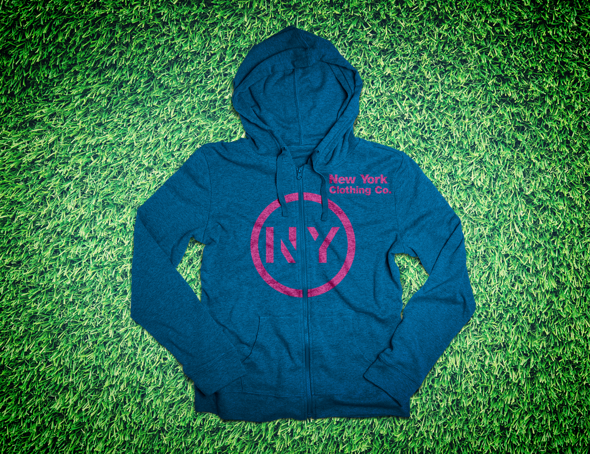
STANDARDIZED VALUE & MARKET RELIABILITY
A Staple Selling Showcase
Here is an example of the staple selling merchandise item showcasing the conceptual NY icon. Many of these items would be shelved within the Capital Clothing Co's front line promotions and they are intended to be the cost effective and brand 'inclusionary' items that teens & youth could invest in just to be a part of the brand.